Optimizing an Airport’s Homepage for Seamless Traveler Navigation


Brand Recognition
A refresh of the website would leave a positive impression not only the airport, but on the Canton-Akron area as well.
Abandonment Rate
By making critical tasks easier to complete, users are less likely to abandon their journey and book a flight or find the resources they need.
Conversion Rate
By making the website more engaging and placing more relevant content on the homepage, users are more likely to book a flight through CAK.

problems
The CAK airport website needed a more pointed strategy to better help visitors
Upon reviewing the CAK website's homepage, I concluded that the design was outdated; tasks like searching for flights weren't intuitive enough, and information on accessibility was hard to find.
CAK is a small airport, but there's a great opportunity to use design and UX as a strategy to increase brand recognition and time-on-task.
Project Highlight
I scanned the websites of airlines across the country and within Ohio to try and find out what their priorities are in regards to the information on their homepages.

Project Process
I explored larger airline websites to see what info was important enough for them to put on their homepage
Market Research
Homepage Structure
Visual Aesthetic
Figma Mockups


Empathize
I put myself in the shoes of a user wanting to search for available flights or find resources on accessibility.
Define
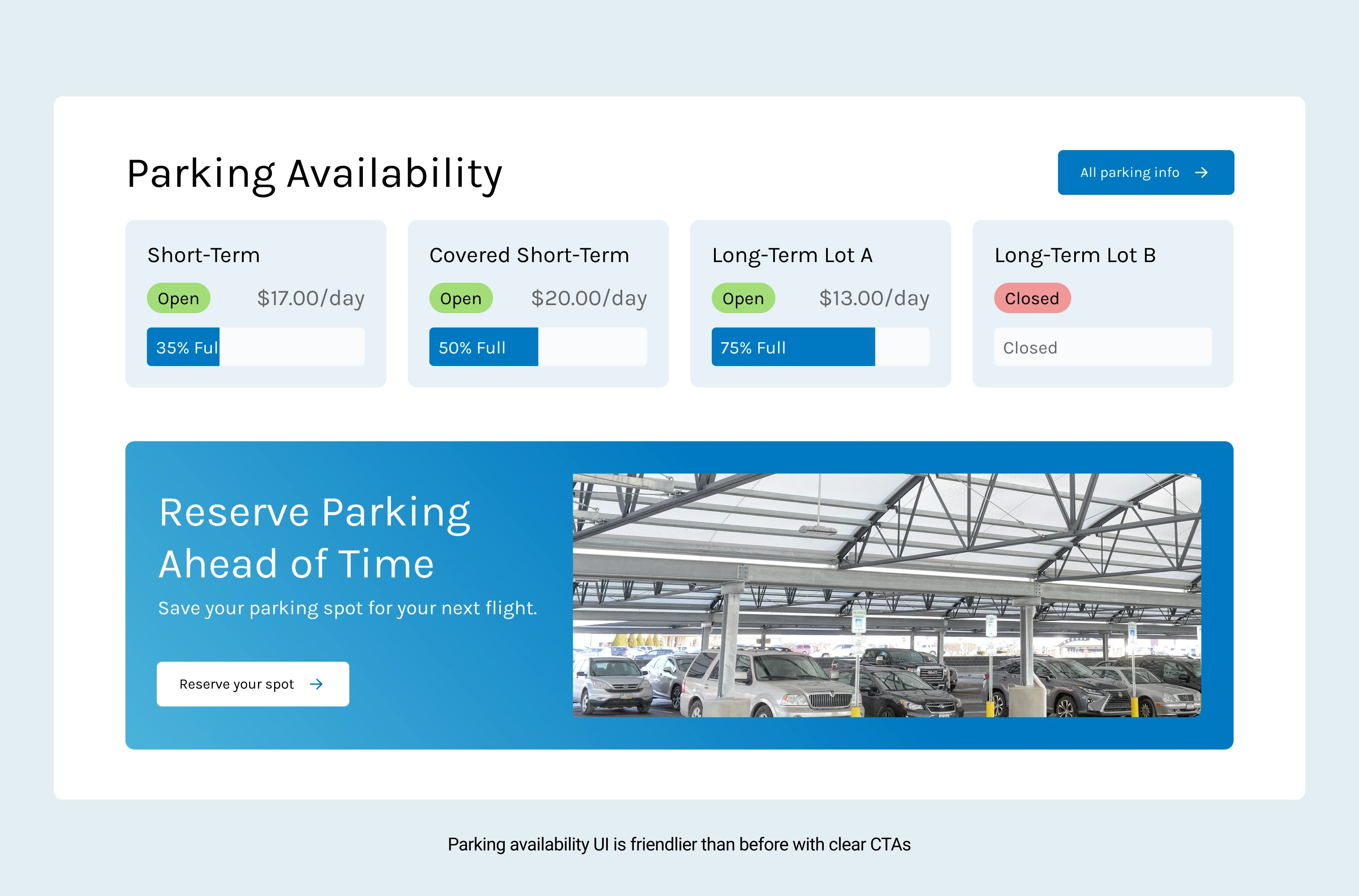
To help website visitors best, we needed to serve up more relevant content and wrap it up in a clean, modern design language.
Ideate
I listed out the sections of content featured on other airline websites and chose which would make the most sense for CAK.
Prototype
Using Figma I mocked up the homepage with my new designs.
Test
No testing was conducted on a project like this.
Implement
This project wasn't taken any further than my Figma mockups.

